Sunday, May 23, 2010

Wall Envy

I've been noticing a ton of 3-Dimensionality on walls lately. I think people are bored with flat surfaces, are completely over decorative finishes and are looking to create walls with punch! That means walls completely covered in everything from framed mirrors to paper cut-outs. I was watching 9 By Design...my new fave reality tv show. It's on Bravo. Check it out of you haven't yet... and designer Cortney Novogratz covered a client's office walls with about a hundred different colored hard hats. Makes sense because the client is a developer. I think we're going to see this concept of thinking outside the proverbial box when it comes to walls for a loooong time. Can't wait to see how the trend develops and where it goes...


For those of you who want just a bit of 3-d...turn to wallcovering designer Maya Romanoff. He is such an innovator when it comes to creating his products... Glass beads, oyster shells, even wood veneer and leather. Major sophistication and definitely unique. The cut paper flower blossoms depicted (above left) were something the Maya Romanoff team developed for the stairwell of a recent show house... Love it!!!


Mirror, Mirror on the wall! (top image)
Maya Romanoff "paper"... (bottom image)

Sunday, January 24, 2010

Sleeping In


I slept until noon today. Okay... I just lied. I slept until TWO today. Maybe it was the heavy rain pattering outside my window, or maybe it was the really good wine I had at dinner last night to celebrate my friend's 40th. Whatever the reason, I obviously needed the sleep, and it felt really good.


(Photo: Ann Gish, from her "Ready To Bed" Collection)


I'm actually lounging in bed right now as I write this post...another reason why I love my job...and it made me think of what's really important when designing one's bedroom. When I was married, my husband and I always decorated the public spaces of our houses before tackling our own "sacred space". (Maybe that's why we're divorced, but I digress). We didn't realize how important one's bedroom is to the necessary daily processes of unwinding and rejuvenating. Designing your bedroom should never be an afterthought. It should always be numero uno on the list.


And as far as stretching your dollar is concerned, consider the functional, foundational aspects of your bedroom (i.e., a proper mattress) your top priority and investment.


Have you ever been a guest in a beautiful bedroom, only to toss and turn all night because the mattress is hard, springy and uncomfortable? I have had many clients over the years invest in gorgeous, very expensive bedroom furnishings, but insist on keeping their 30 year old crappy mattress. It makes no sense to me. No matter how beautiful looking your bedroom is, you're not going to enjoy it if you can't sleep well. Usually a worn out mattress is the culprit.


Ones to consider investing in are Kingsdown and Duxiana. These are definitely high-end mattress lines, but are well worth the dollars. Don't get sticker shock. Their construction, technology and materials used are far superior to more recognizable name brands. Sorry, but it's true. I haven't slept on that foamy Tempur-Pedic thing, but friends who have purchased it, swear by it. And, for those of you who are more budget conscious...and who isn't these days?... I slept on a bed at a Renaissance Hotel recently (they're owned by Marriott) and my bed was awesome. It was a Sealy Posturpedic, and you can purchase the exact mattress and all of the divine bedding that went with it on the hotel's website.


Another area where people get confused is the actual bed linens. First of all, you need to know that thread count is not as important as thread content and weave construction. Don't be fooled. 1500 thread count doesn't really mean anything if the thread is crap. Most people love 100% Egyptian cotton. Percale is the finest, but I love sateen (not satin). Sateen is a type of weave that produces a very soft, smooth feel. With sateen, you can usually get a really nice feel with a lesser thread count and a lesser amount of money. But... you haven't lived until you've slept on 100% linen sheets that have been washed multiple times for extra softness. Yummy. Put it on your 'bucket list'.

Two companies that I think are the King and Queen of the bedding industry are Frette Linens from Italy and Ann Gish. We're talking pricey stuff here, but again, well worth the investment. Fine silks, cottons and linens in beautiful, elegant, classic designs that won't go out of style any time soon. When you think about the yardages of fabrics, the fine detailing and design, and the many years of enjoyment you will get out of it, the money begins to make complete sense. Ann Gish offers a "Ready To Bed" line that is a bit less expensive than her more couture brand, but you will still end up dropping a few thousand on a complete bedding ensemble.


(Photo: Ann Gish's signature Seaflower Pillows)


(Photo: Frette Linen's example of a perfect room for a rainy day!)

Friday, January 15, 2010

Bobo Intriguing Objects

In my market recap post, I mentioned the showroom that I could move right into and set
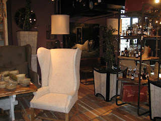
up residence... Bobo Intriguing objects. "Juxtaposition" is my favorite design technique, and Bobo owners Mark Sage and Rudy Njissen are masters at it. They are so good at it, that the style they have made famous landed right onto the pages and the retail floors of Restoration Hardware. While some in the design industry cry "sellout"...I do just the opposite. I believe that great design should be available at EVERY level of the market. And... selfishly, I am happy that (yet another) design trend I was emotionally drawn to years ago is embraced and celebrated by designers and the average Joe alike. It tells me I'm good at what I do. ;-) I also know that the Bobo team is strong and talented enough to keep all of us interested for years to come. Their showroom at the January market was loaded with new-old stuff that won't necessarily be seen at the mass level...especially their antique and vintage one-of-a-kinds.

I had a chance to sit down and interview Heather Antonelli, who recently joined Bobo in product development and scours every corner of the globe to find and create new furniture pieces, lighting, accessories, art and...well...other intriguing objects. Bobo stands for Bohemian Bourgeois, and is an eclectic mix of pieces with a heavy Belgian influence. (This is based on Mark and Rudy's many years of experience dealing antiques from that country).

"Refined Earthiness" is how Heather best sums it up, and it's what I love so much about their style. (There's that juxtaposition thing again)! Classic shapes...like a basic wing chair...are exaggerated in scale for impact and then covered with bleached, slightly flawed canvas. I immediately want to sit in it. Wearing a tee shirt, holey jeans and stilettos.

Scale is purposely large as some of Bobo's pieces are reproductions of cabinets from old pharmacies and bakeries in Belgium...and some of these repros are even fitted with old, leaded glass doors.

Bobo is really big on re-using and re-purposing materials, another reason why I love them so much. Mundane items (like a brick maker's palette) laying around their Polish factory might wind up as a coffee table. Reclaimed railroad ties from Europe's old abandoned railroads are being scooped up and turned into shelves and table tops. Recycled tires look and feel just like slate and are used to top delicate iron accent tables. An elegantly lined bench is topped with a cushion upholstered in old truck tarp material. Gnarled sticks from the factory yard are cut into bits, hollowed out and strung together to create super cool light fixtures!...All of this is complimented by a small spot of mercury glass, a crystal chandelier and some over-scaled fine art.

It's this interesting play of rough and refined, classic and rustic, with just a smidge of opulence thrown in that makes Bobo so appealing to so many...including me.

(P.S. I know I promised video from the Atlanta Market, but my videography skills are clearly sub-par. I will eventually master my new Flip camera...Until then, I hope the photos suffice).


Wednesday, January 13, 2010

Atlanta Market Update!


The Home Furnishings market at AmericasMart-Atlanta was 7 days packed with visiting beautiful showrooms, listening to prolific speakers (namely Thom Filicia who impressed me the most), and fun events. As promised, I want to recap some of what I saw. As a general overview, I have to say, the design theme for the start of the new decade was loud and clear to me…but, ironically, it is “SOFT and QUIET”! Most of the design oriented showrooms featured wispy neutrals like creams and taupes, soft textures, and classic subdued lines. It was evident, everywhere, that finding peace and serenity at home is going to be at the forefront of the design industry for a while. This makes me super happy, because as many of you already know, this aesthetic is my personal favorite.

As always, in lower price points and/or accent pieces and rugs, color was bright…Acidic greens paired with turquoise, fuchsia, orange and yellow. (I didn’t see as much purple at this show…If I did, it was muted or soft to blend with the grey-ish neutrals that were everywhere). Most of these brights were paired with chocolate or charcoal to make them pop in a sophisticated way.

Where metals are concerned, matte gold is still quite strong. Really, matte everything…pewter, bronze, silver, etc. The intense shine of chrome, so popular in the last decade, doesn’t necessarily lend itself to serenity. Matted, muted, delicate shimmers are much more conducive to creating a calming space and nicely compliment the other soft textures like cashmere, felt, and wool.

Simple lines, no matter what era of history inspired them, were also prevalent. From Ancient Greek to French Louis to Classic Modern, the furniture shapes are simple enough to stand the test of time. As people are more aware of their spending, it is smart for furniture manufacturers to create pieces that customers will want to invest in. We might be willing to spend a little more on something we think will have lasting quality and value.

My favorite showrooms are probably no surprise to you… jdouglas (http://www.jdouglas.com/) is a rep show room that features several lines that I love, namely, Aidan Gray (http://www.aidangrayhome.com/) and Arteriors (http://www.arteriorshome.com/ ). Some people are getting a little tired of Arteriors because they have become somewhat saturated in the market. I still think their lighting and accessories are relevant and certainly stand the test of time.


Others demonstrating the softness that dominated the market were Peninsula Home (http://www.phcollection.com/ ) and Zentique (http://www.zentique.com/ ).


In the rug category, French Accents Rugs & Tapestries was the clear winner. I wish I had a chance to take a photo of their showroom. Danny promised to send me some pics of their new products, but he hasn’t yet. For now, check out their website http://www.farugs.com/ . Unfortunately, it doesn’t do their line justice at all. Their designs are STUNNING! Very fresh takes on classics, beautiful color combinations and gorgeous wools and silks. My favorites this show were from their Ikat collection. Yummy.

Art Imaage (http://www.artimaage.com/) provided some of the best art I saw at this market. They are a wonderful trade-only resource for beautiful oils in all subject categories. Plus, the creative director, Rosa Martin, will act as your personal art consultant, searching for whatever you need for your client projects. ..”even a Picasso”!

Last, but not least…my favorite showroom deserves it’s very own blog post…It’s coming up next. I walked in and thought to myself, “I could live here.” So I sat down and interviewed Heather Antonelli, their new product designer/world-wide resourcer to find out about what’s in store for this innovative furniture and accessories source. It’s none other than…Bobo…Stay tuned!

Tuesday, January 12, 2010

RUGS: AmericasMart's Museum of Introductions Gallery


So, the last ten days have been an absolute whirlwind. Beginning January 2nd, when I began setup of AmericasMart's Museum of Introductions gallery which consisted of 80+ rug entries for the America's Magnificent Carpet Awards. It was a ton of hard work (thankfully, I had some help from Vanguard students and grads!), and it turned out great... Architectural Digest sponsored the awards, and the winners (11 in all) were thrilled to receive their trophies! Congrats to: Renaissance, Loloi, Marcella Fine Rugs, Couristan, Neman, Chaman Antiques, Kalaty, Colonial Mills, Ariana, Capa, and Amici!! The winners will be featured in an upcoming issue of Architectural Digest, and on http://www.shopad.net/ , Architectural Digest's online home decor resource.

Thursday, January 7, 2010

Home Furnishings Market in Atlanta

I'm heading to AmericasMart-Atlanta for the January Home Furnishings Market. I can't wait to see what's new. I plan to bring along my new Flip camera and post videos of the latest and greatest design trends! If you're in Atlanta, stop by my design school on the 14th floor of Building 1. On Saturday, celebrity designers Thom Filicia and Kathryn M. Ireland will be speaking in the seminar room! Stay tuned...

Monday, November 23, 2009


When I was about 10 years old, I remember attending a family event at a local historic inn in my hometown on Long Island. There were about twelve of us there for a sit-down dinner, and we had a private room off the main restaurant. At one time, the room must have been a library because there were floor-to-12'ceiling bookshelves overstuffed with leather bound books! I remember dining by candle light in that room and feeling sooooo royal. I had never seen anything like it.


Fast forward a couple of decades (okay...three), and here we are maximizing functionality of rooms in our own (often less regal) homes. So much so, that it is not uncommon for people to utilize what is typically the most under used room in the house, the dining room, as a library/study space (when the table is not functioning as a pedestal base for a turkey platter).


Part of loving your space is USING it, and finding ways to maximize every inch of it. I started seeing examples of dual-purposing dining rooms a few years ago. It's much more common now, and we are enjoying these spaces on a daily basis instead of just once or twice a year. Makes sense since we tend to spend a lot of money to furnish it well.


Also, try not to lock yourself in to the room names indicated on your home's blueprints! One of the best things I ever did for a client was flip-flop the locations of their family room and dining room. The "family room" became a cozy, intimate space for TV viewing, and the "dining room" became the main living area of the home...complete with oval table, settee, oversized upholstered chairs...fireplace, bookshelves and French doors to a beautiful covered flagstone patio. It's definitely the most used room of the house now.


As you're gathered around the dining table this Thursday, as most of us will be, think about how you use your dining room...and what you can do to this space to enjoy it on a more regular basis!
Happy Thanksgiving!